Why a flat map fails to accurately depict Earth
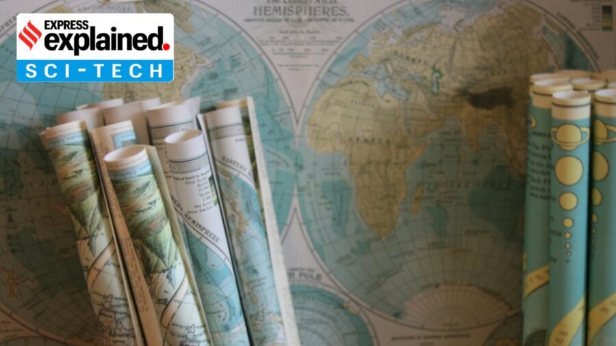
The United Nations has adopted a resolution to shift away from the 16th-century Mercator map of the world towards one that more accurately depicts Africa’s vast size.
At a UN General Assembly session, 164 countries (including India) voted to adopt the 2018 Equal Earth design — with the US voting against the Togo-led resolution, and six countries abstaining. Since UN resolutions are not binding, it remains to be seen if or when governments, organisations and classrooms adopt it.
Advertisement
The Mercator layout has been the world’s most widely used projection for centuries. But it has also long been criticised for exaggerating the size of regions towards the poles relative to those closer to the equator. The most infamous example of these distortions is its depiction of the African continent, which appears similar to Greenland — an island 14 times smaller and about the size of the Democratic Republic of the Congo.
The 2018 Equal Earth design, developed by an international team of cartographers, also comes with its own limitations. But its supporters say it will help reverse “colonial” perceptions of Africa.
No flat map can accurately portray the three-dimensional Earth. Every projection involves trade-offs, depending on its purpose.
Advertisement
How did the Mercator map come to be the most commonly used depiction of the world? And why is it so difficult to map the world?
The Earth is not a sphere
The first thing we need to understand is that the Earth is not a sphere, though it is sometimes treated as one to make mathematical calculations easier.
It bulges in the middle due to its spin, the Moon’s gravity warps it, and the continents and oceans distort the shape, said Maj Gen (Dr) Siva Kumar Rachapudi (retd), a scientist who has played a key role in promoting geospatial technologies across government, academia and industry for decades. This means the best way to represent Earth is a spheroid, which is a three-dimensional shape created from a two-dimensional ellipse, Siva Kumar, who has also been a senior official at the Department for Science and Technology, told .
But carrying a globe around is impractical. This brings us to projections. The term refers to the transformation of a three-dimensional space onto a two-dimensional map. There are many different types of projections. Some of them are:
– Conformal projections (which preserve angles)
– Equal-area projections (which preserve areas, such as the newly adopted map)
– Equidistant projections (which maintain distance)
– Compromise projections (which balances distortions in area, shape, distance and direction rather than preserving any one of them exactly)
We shall explain what the terms area, shape, distance and direction mean in cartography further ahead. For now, suffice it to say that the Mercator layout is a conformal projection.
The origins of the Mercator projection
The Mercator layout was introduced by the Flemish (present-day Belgium) geographer and mapmaker Gerardus Mercator in 1569 to help sailors navigate the world.
It is a conformal, cylindrical map. This means Mercator projected the Earth’s surface as if unwrapped from a cylinder around the globe.
“In the 18th century, it became the standard map projection for navigation due to its property of representing rhumb lines as straight lines,” said Siva Kumar.
So, if you drew a straight line from Mumbai to Muscat on a Mercator map, you could point your ship in the same compass direction throughout the journey and reach your destination. This was a major advantage over other map projections, where a constant-direction route would appear curved.
The Mercator’s colonial lens
The Mercator projection has a grid pattern with longitudes and latitudes at 90-degree angles. The longitudes (vertical lines) are evenly spaced, but the distances between the latitudes (horizontal lines) increase as one moves away from the equator towards the poles.
This is deliberate. “To preserve shapes, the ratio of increase in the length of the parallels is kept exactly the same with respect to the increase in the length of the meridians,” said Dr Bimal Kumar Kar, president of the Indian National Cartographic Association and former head of Gauhati University’s geography department.
The result is that Mercator projection inflates the size of lands the farther they are from the equator. “Therefore, landmasses such as Greenland and Antarctica appear far larger than they actually are relative to landmasses near the equator,” said Siva Kumar.
Mercator’s projection helped Western cartographers easily mark towns, cities, and roads in their part of the world. “Its popularity also lies in its ease of construction, since all parallels and meridians are straight lines,” said Kar.
This Western-centric view is what has come in for criticism.
“…if you’re a humanist well versed in European imperialism’s harsh imprint on the Third World, the traditional Greenwich-anchored world map becomes a clear example of Western cultural hegemony…” wrote cartography professor Mark Monmonier in his 2004 book Rhumb Lines and Map Wars: A Social History of the Mercator Projection.
“The standard projection was a political tool that contributed to the scramble for Africa, also known as the partition of Africa when Western European powers colonised the continent,” Rabah Arezki, former economist at the World Bank, wrote in Le Monde.
The search for a better map
Every flat representation of the Earth distorts at least one property: area (how large a landmass is relative to others), shape (the true outline and appearance of a country), distance (the actual space between two points) and direction (the correct compass bearing from one location to another).
The one you pick depends on your purpose: representing data, navigation or general reference. This is why, as Kar cautions, one should not directly compare one type of map with another.
Attempts to create other projections began centuries ago.
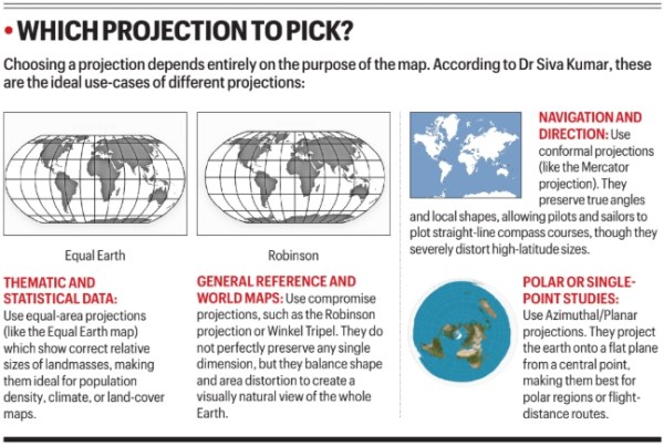 Choosing a projection depends entirely on the purpose of the map.
In 1855, Scottish clergyman James Gall presented a new projection. In 1973, German historian Arno Peters unveiled a very similar map which gained widespread attention. While it preserves area accurately, it makes landmasses look stretched or squashed. In 2017, schools in Boston introduced it.
In 1963, geographer Arthur H Robinson devised the Robinson projection which tried to better balance the sizes and shapes of land masses and sought to solve the “Greenland problem”. It’s a compromise projection (which we explained above), with meridians curving gently towards the poles.
In 1921, German cartographer Oswald Winkel devised the similar Winkel Tripel projection, seeking to reduce distortion across area, distance and direction. In 1998, it replaced the Robinson projection in world maps made by the National Geographic Society. Schools and textbooks followed, as did the World Bank. This is also a compromise projection.
The Equal Earth map
The Equal Earth map, developed in 2018, is an equal area projection (there are others, too) that seeks to preserve the relative areas of landmasses. It, too, somewhat distorts shapes and distances, with meridians curving gently towards the poles.
“The Mercator projection heavily exaggerates regions closer to the poles, which visually diminishes the perceived scale of developing regions in the Global South, including South Asia. Equal Earth fixes this imbalance,” said Siva Kumar.
But is the new map an improvement over previous maps such as the Robinson and Winkel Tripel? Kar says: “To me, it’s nothing special. It has simply drawn attention by comparing itself with Mercator’s projection, which was designed for a different purpose.” But since it is an equal area map projection with limited shape distortion, it can be used by all categories of users, he said.
According to Siva Kumar, the Equal Earth map is best used to represent thematic and statistical data. “For classrooms and research, it provides a mathematically accurate depiction of area, which is vital for visualising population density, climate impacts, and resource distribution across the Indian subcontinent,” he said.
A World Bank spokesperson told Reuters that they already use the Winkel Tripel or Equal Earth for static maps and are phasing out Mercator on web maps.
Google Maps offers you the option of either using a Mercator or a 3D globe view on desktop. On the mobile app, however, the Mercator projection remains the default, Reuters reported.
The Koran and politics of purdah
By Sohail Khan · 22 Sep
Persistent antagonism towards Urdu
By Sohail Khan · 22 Sep
How ‘kaata wash’ helps preserve the delicate Dhakai jamdani sari
By Sohail Khan · 21 Sep
Leave a Reply